Twitter Design System
A complete re-design of Twitter's design language focusing on grounding the system around principles, design techniques, and research. The evolution not only improves the look of Twitter but is an internal tool used by the team to create a unified product.
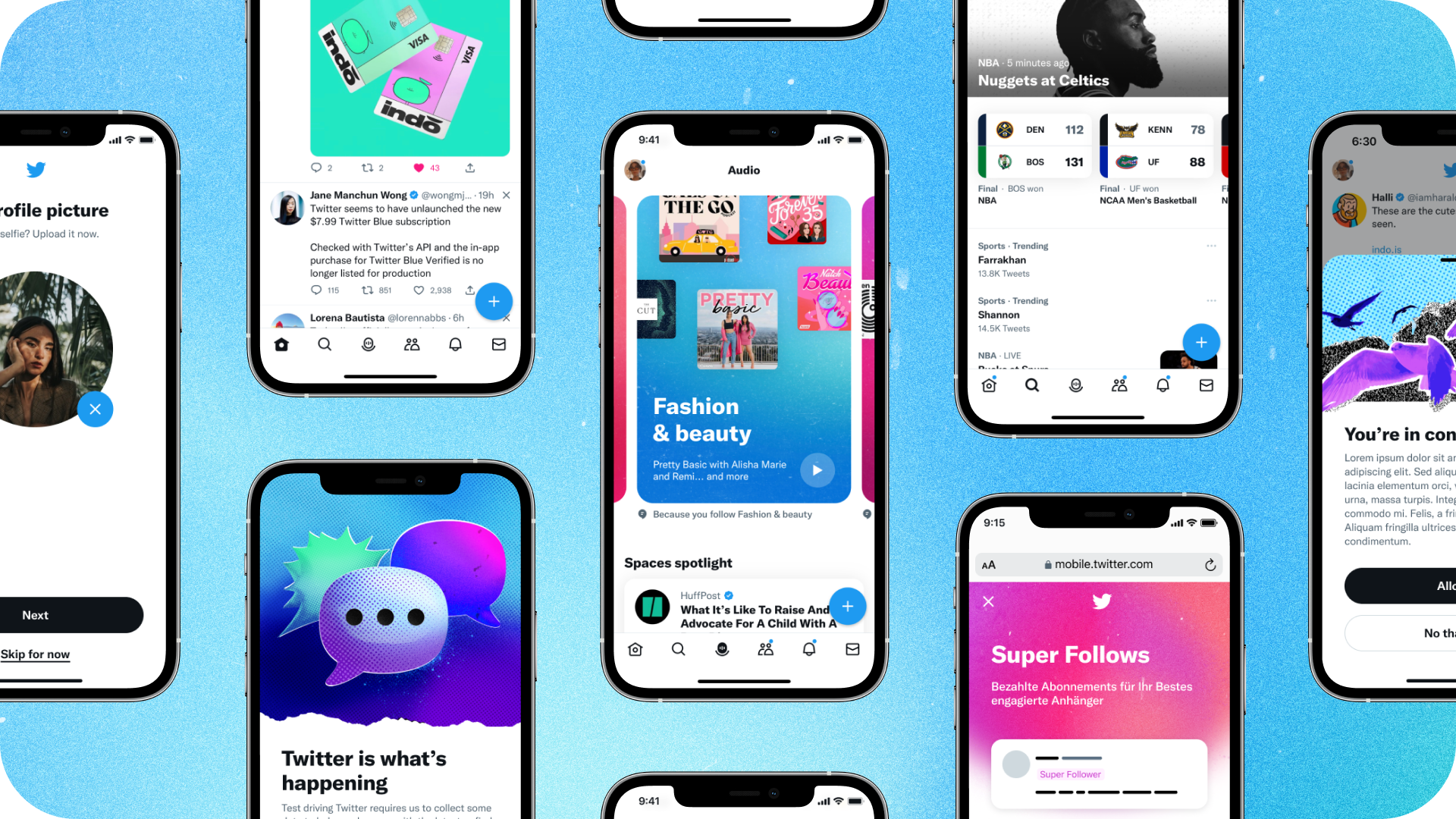
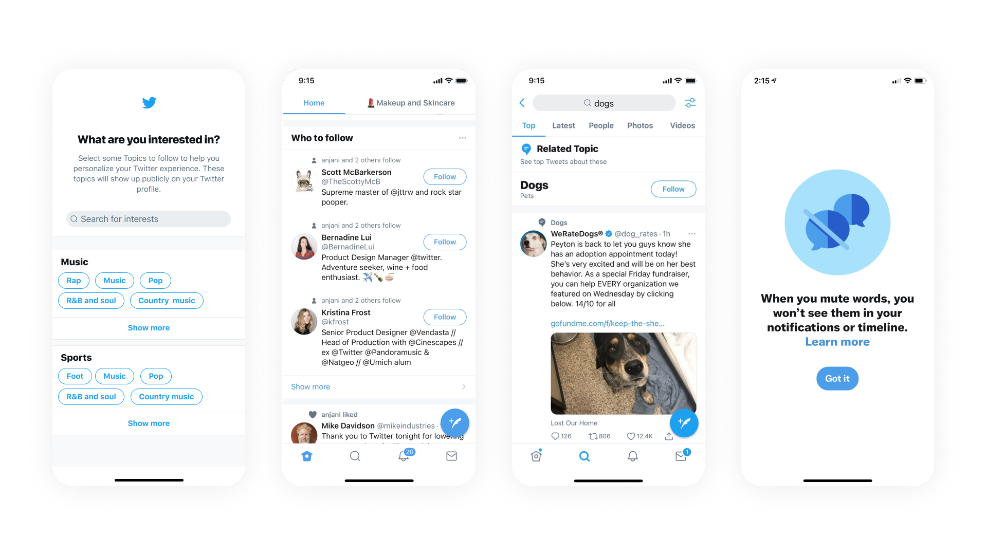
The Before
Before launching the re-design of the product, Twitter felt dated and cluttered. It lacked type hierarchy and contrast. The design didn't align with the brand refresh, which was very expressive.
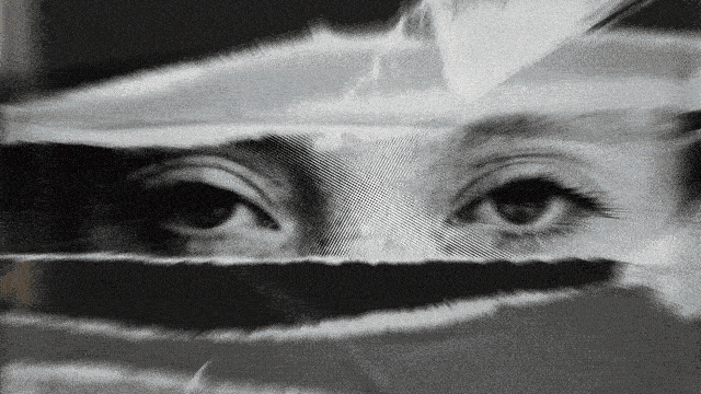
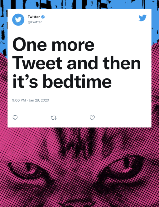
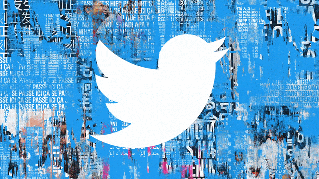
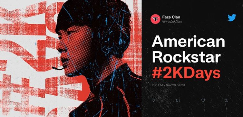
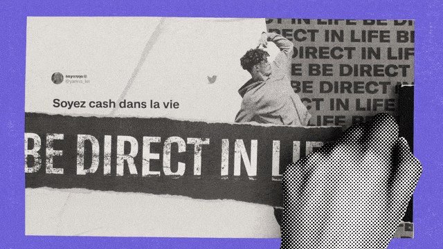
Brand Re-fresh
Twitter's brand new look and feel launched in 2021. The brand reflects the messiness of life online, feeling perfectly imperfect, with textures, halftones, and paper tears at its core. When creating the design system, we had to thoughtfully find ways to incorporate the rebrand into a product space.
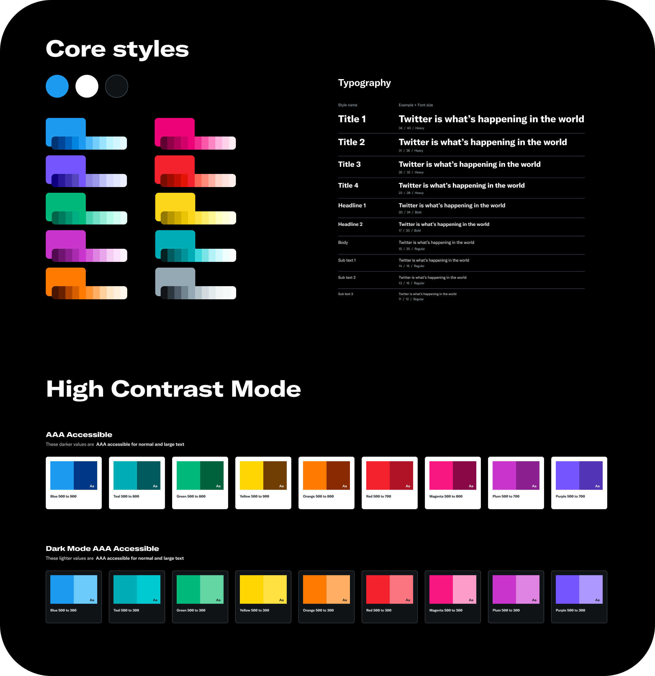
System Foundation
⇩
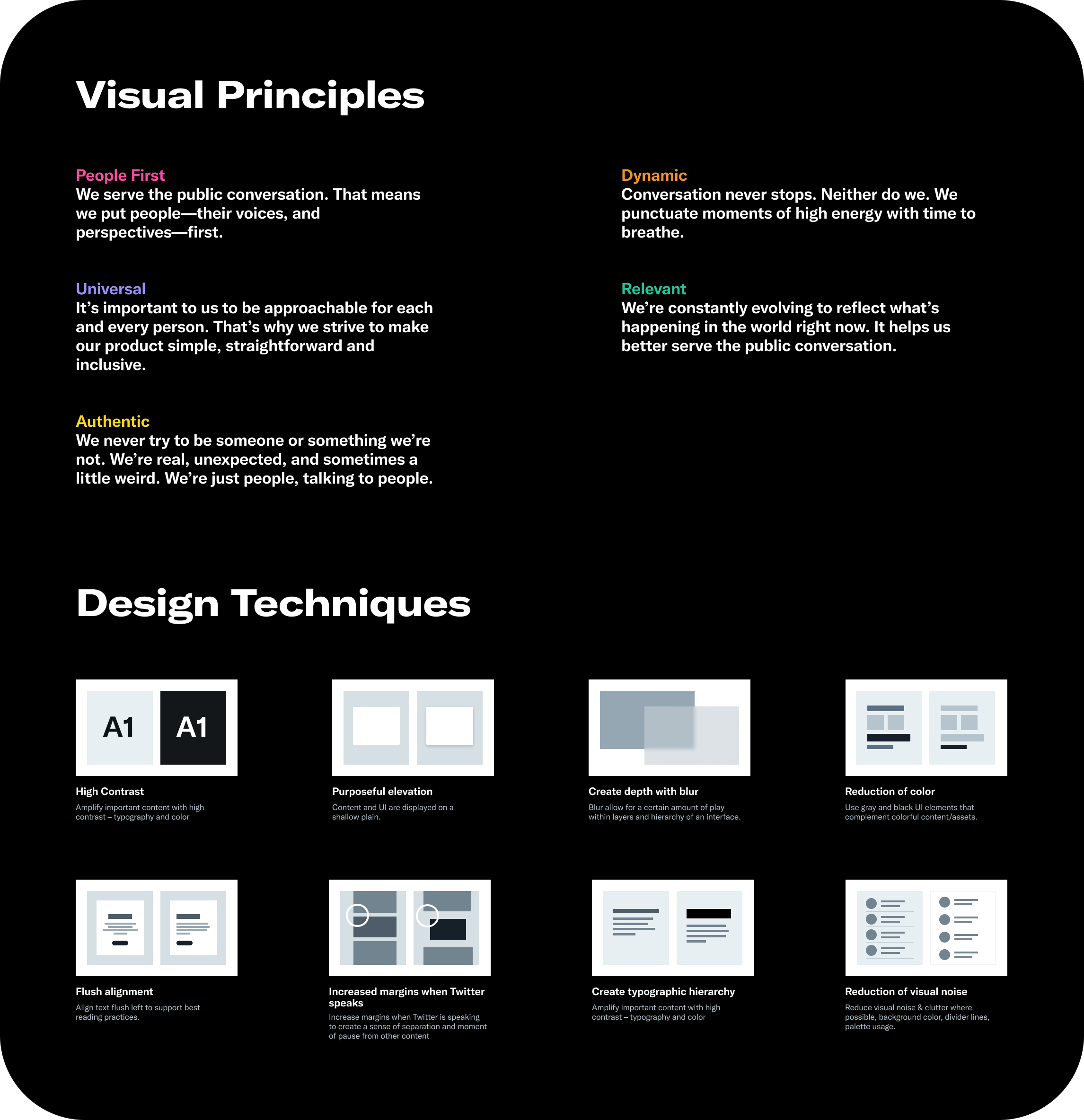
Principles
Techniques
Color
Type
Accessibility
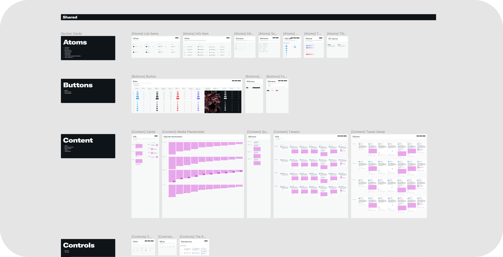
Component Library
⇩
Thousands of variants
All platforms
Responsive
Used by the millions
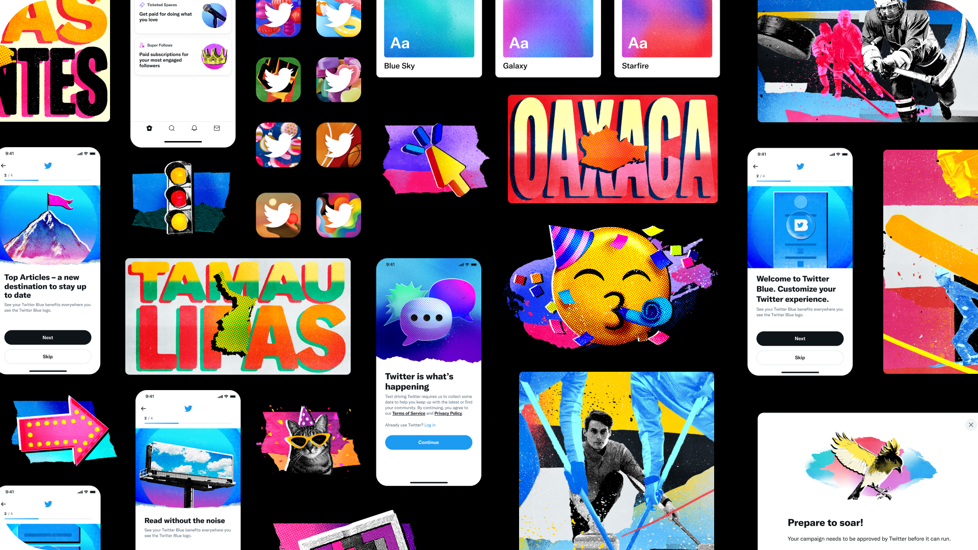
Creative Systems
⇩
Illustrations
Gradients
Iconography
Twemojis
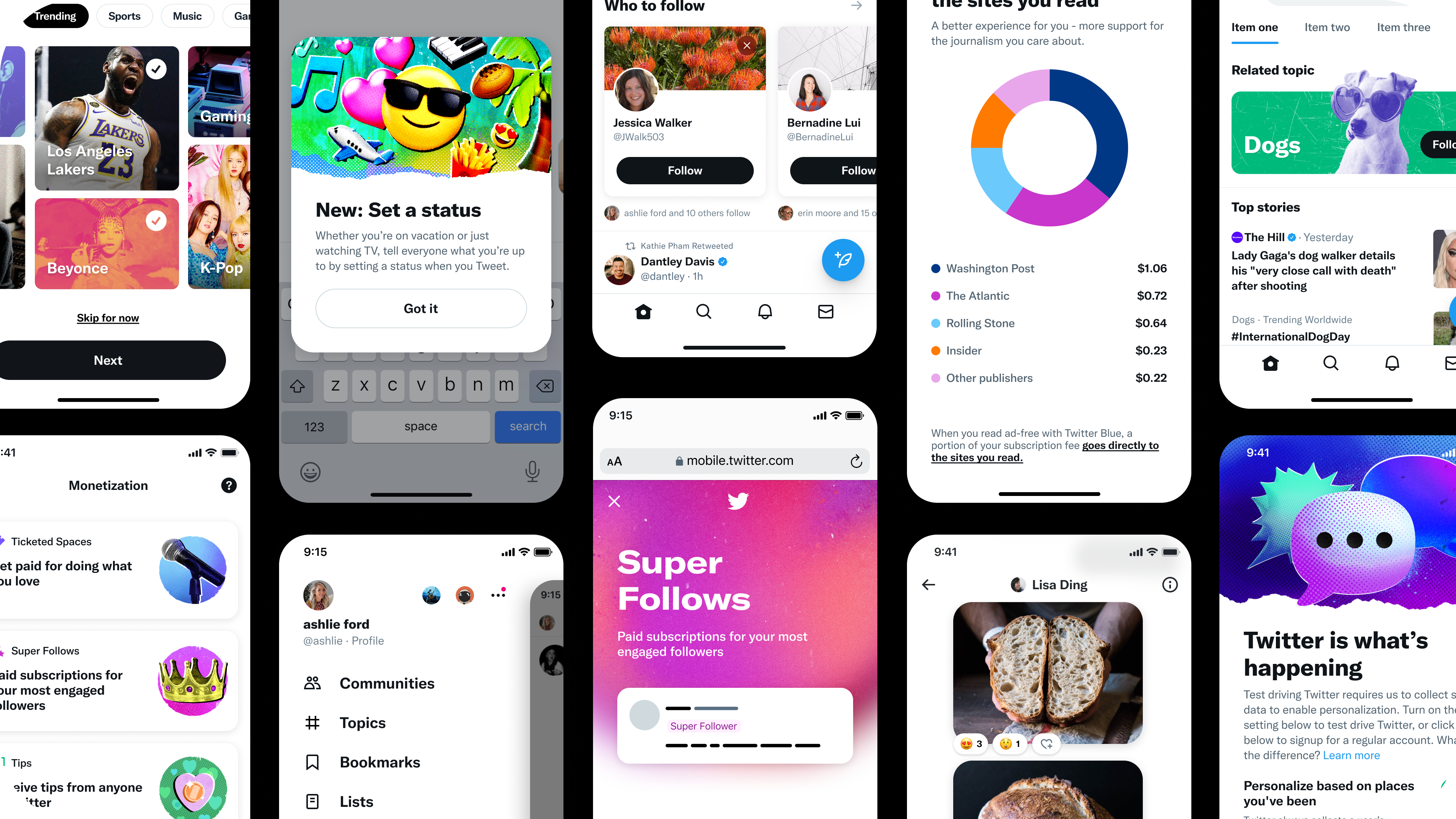
The Big Picture
⇩
Cleaner
Bold
Colorful
On Brand
Team: Design Foundation @ Twitter
Timeline: 2021-2022
Role: Lead Visual Design, Building & Maintaining Components,
Product Component Libraries, Documentation & Guidelines
Consulting & Collaborating w/ XFN Partners, Working w/ Eng, Vision work